Tonka Park - Branding
The intention was to express humility and honesty through the lettering. To subtly allude to the park theme while dodging any connection of being eco-friendly. The counters within the A take on the form of a leaf while the stem of the A and R grow thicker towards the end, akin to the stem of a leaf. Finally, the ascender of the K is slightly taller than the T, lending a delicate nod to the form of a tree branch.
The intention was to express humility and honesty through the lettering. To subtly allude to the park theme while dodging any connection of being eco-friendly. The counters within the A take on the form of a leaf while the stem of the A and R grow thicker towards the end, akin to the stem of a leaf. Finally, the ascender of the K is slightly taller than the T, lending a delicate nod to the form of a tree branch.

Web Design
BEHANCE'S WEB DESIGN SERVED.
BEHANCE'S WEB DESIGN SERVED.

Ecommerce Theme
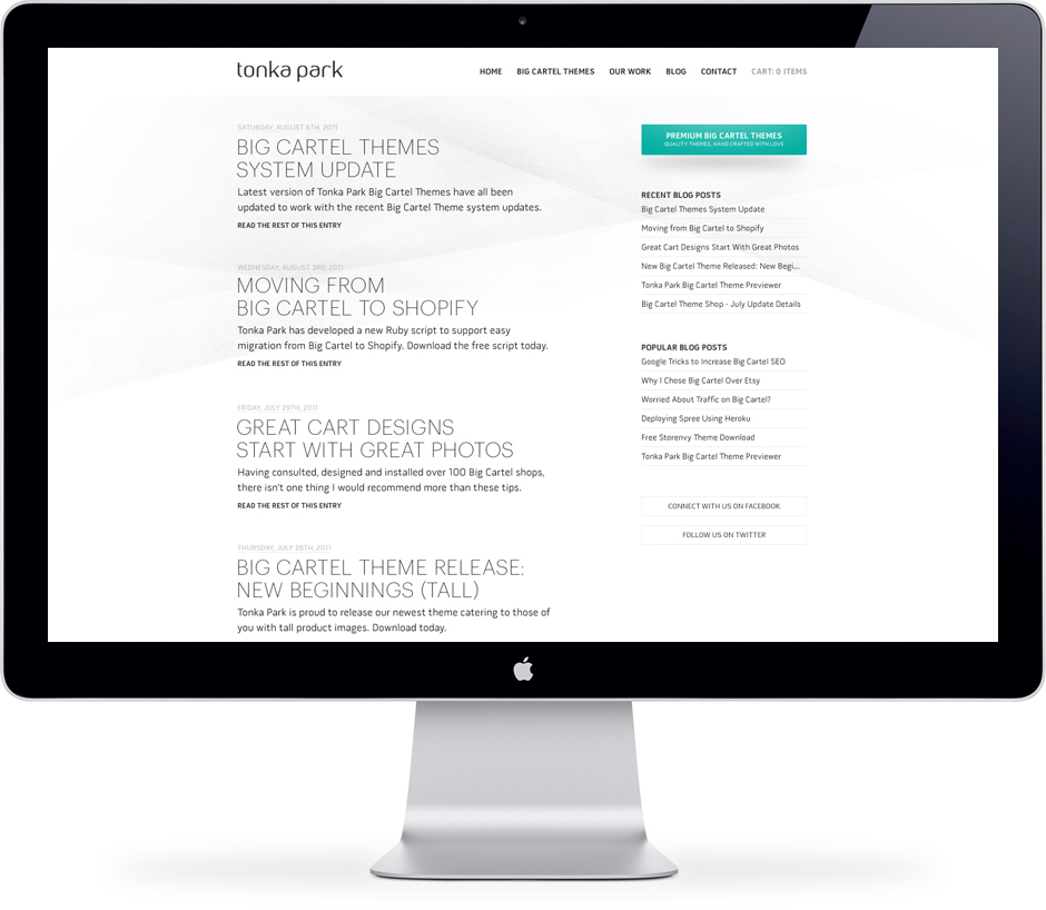
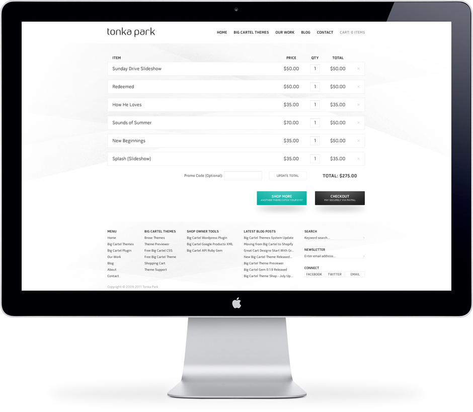
An elegantly mellow Big Cartel theme was designed to accompany the relaunch of Tonka Park's Big Cartel theme shop. It is highlighted by its tranquil user experience.
An elegantly mellow Big Cartel theme was designed to accompany the relaunch of Tonka Park's Big Cartel theme shop. It is highlighted by its tranquil user experience.


